


Colour has always had an important, yet often poorly understood, role in marketing. Brands can build their entire personality around a particular colour and incorporate this
We can think of many examples where colours are used strategically by brands, yet we often never question why they used a particular colour scheme. Take Coca-Cola for example – immediately the colour red springs to mind – strong, solid, saturated red – not a pastel shade – a really strong vibrant red. Other brands which have dominated a particular colour include Guinness – and the dominant colour black; JCB and yellow; Facebook and blue; Apple and white, Cadbury’s and purple and then there are the multicolour brands e.g. Google and eBay.
How much thought and research went into the colour selections associated with each of these brand personalities is not obvious, however, the research suggests that in many instances there is considerable evidence to support the rationale for using colour to reinforce brand personality.
In this review, the literature associated with colour and marketing is assessed on how colour influences dimensions of brand personality and what significant associations are observed. The strategic use of colour by brands is discussed as well as how colour is perceived differently across different cultures and how this impacts on marketing in a globalised world. Following this the paper looks at how colour is applied in a marketing context in both the online environment, in areas such as web design and advertising and in the offline world, including in retail, especially in packaging and promotional cues.
A series of studies by Labrecque et al. looked at a number of key areas of investigation of the effects of colour in marketing. In a first study, they investigated the relationships between hue (the wavelength of the light, in essence, the colour) and brand personality. The assessed attitudes towards logos with different colour schemes in a group of 279 undergraduate students, looking at associated brand personality dimensions of sincerity, excitement, ruggedness, sophistication and competence. They found significant relationships between red and excitement; blue and competence; white and sincerity; black, pink and purple with sophistication and brown with ruggedness.
In a second study, they examined the role of saturation and if this amplified brand personality traits. They found that high saturation increases arousal and excitement and also shows a significant relationship with ruggedness. They further went on to demonstrate how marketers can strategically use colour to alter brand personality and purchase intent and how colour influences the likability and familiarity of a brand.
The combination of hue and saturation can communicate subliminal messaging and brand personality to the consumer. For example, many call-to-action buttons on e-commerce websites are in the red hue spectrum, leading to increased arousal associated with shopping and increased conversion rates. In contrast, the predominant colour used in many healthcare websites is blue (as well as anecdotally in the doctor’s surgery) and this is associated with competence, a critical reinforcement factor for one seeking medical help.
One of the key objectives of a brand is to stand out in a crowded marketplace and colour has the propensity to deliver this. In a study by Romaniuk et al 2014, they discussed approaches to measuring the strength of colour as a brand-identity element. They discussed two key dimensions in assessing the strength of the link between colour and brand identity (a) fame; which reflects how many people can retrieve the link between the colour and the brand name and (b) uniqueness; which captures the competitiveness of other items/brands linked to the same colour cue.
Their research highlights some important methodological considerations when conducting research on colour and brand identity – not only is it critical for the brand to initiate a recall when prompted by the associated colour but it also needs to be the first brand to be recalled by that particular colour. They discuss the example of yellow and fast food restaurants – both Burger King and McDonald’s use yellow in their brand identity; however it may be argued that McDonald’s scored higher on uniqueness as more user recall McDonalds first when asked the question ‘what fast food restaurant brand do you think of with the colour yellow?’ Thus the challenge for marketers is not only to create a powerful association between the brand and a particular colour but also to build a stronger association than their competitors who may be using similar brand identity elements.
Another key challenge for global brands trying to effectively utilise colour in brand identity is the existence of cross-cultural differences in the response to colour stimuli. A study by Madden et al. looked at differences in colour meanings and preferences across different cultures. The authors explored consumers’ preferences for different colours and colour combinations in a study sample spanning eight countries. The results highlighted some interesting similarities and differences. Users were asked to rate colours against a differential scale of meanings and clustering of colour and meanings were discovered. In all countries, blue, green, and white are strongly associated with ‘peaceful’, ‘gentle’ and ‘calming’ response meanings and occurred in clusters. Black and brown tended to have strongly held associations of “sad” and “stale” across cultures. The colour red tended to stand alone, not clustering with other colours and having different meanings across all countries studied. However, red was consistently associated with “active,” “hot,” and “vibrant” in many of the countries studied.
The authors put forward a key managerial implication of their research – marketing managers should not just presume that the colour selections for their brand in one country will automatically elicit the same consumer responses and attitudes in another country. Thought should be given as to how colour is perceived in different geographies.
Another study by Cyr et. al. looked at colour appeal in website designs across different cultures. In their study, three different websites which incorporated different colour schemes were tested against three distinct cultural groups of thirty participants each in Canada, Germany and Japan. The authors assessed the different groups with respect to the impact of each colour scheme on dimensions including user trust, satisfaction and online loyalty in a laboratory setting using techniques including eye-tracking, surveys and interviews. The results of the study revealed that colour appeal is a significant predictor of website trust and loyalty and that significant differences were observed across the different cultures measured.
Aslam et. al. argued that colour now forms a critical role in global marketing strategy by corporations because of these cross-cultural differences. Marketing managers need to take into consideration the cultural values, the marketing objectives and the desired response from the customer when choosing how to creatively progress marketing campaigns across different cultures.
Fig.1 The cross-cultural meanings and associations of colour in marketing
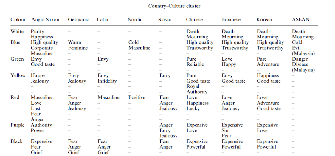
Adapted from Aslam et. al. (2006)
Given the diversity of responses and attitudes to colour across different cultures demonstrated by Cyr et. al. and Madden et. al. it is evident that consideration must be given to these differences from a marketing perspective. A water filtration startup company may have carried out colour psychology market research before designing their brand identity and decided that for their local target market of the UK and Ireland that white is the perfect brand colour, eliciting attitudes of purity and happiness, as shown in figure 1. However, what they may not have realised is the cross-cultural differences observed in this particular colour – they progress a year or two later to target the Chinese market and are perplexed as to poor brand attitude feedback from focus groups. Unbeknownst to them, white in this culture denotes death and mourning and this subliminal cue elicits a less than favourable response amongst consumers in the Chinese market.
We have seen how colour can give meaning and distinctiveness to brands and how colour exhibits cross-cultural differences in meaning. Another impact of colour in marketing is how it affects perception in the online environment. This is important in the context of online marketing, which one could argue is the future. In a study by Gorn et. al. the effects of screen colour and time perception was investigated. The authors drew on previous research that demonstrated a link between feelings of relaxation and time perception and postulated that the background screen colour of a page that is downloading had an effect on the time perception of the page and the speed of the download. In a series of experiments, they altered the colour of the background screen during a download task to manipulate states of relaxation and found that colors that induce more relaxed feeling states lead to greater perceived quickness. They went on to demonstrate that colour not only affects the perceived rapidity of the download but also their attitudes to the particular website and the likelihood to recommend to others. From a marketing perspective, this has implications for ecommerce; sites which may target users in countries with low broadband penetration should consider these findings when designing the colour schemes for their websites. As the journey may be laboured as the consumer navigates through the site, choosing particular colours which elicit relaxation and influence time perception will increase overall satisfaction, decrease frustration with slow loading content and increase the likelihood of conversion of the desired endpoint.
Colour is also important in the online environment in the context of display advertising. A study by Moore et.al. investigated the effects of banner color and banner color-text color contrast on measures of attention (specifically recall and recognition) and attitudes toward the advertisement and the target website. In their experiments they observed that banner ads which were incongruent with the colour of the website in which they were placed had a more favourable effect on attention, however those ads which were congruent with the colour of the website had a more favourable effect on attitudes. This frames an important juxtaposition – the balance between getting the ad noticed and what impression the ad will elicit. The risk for marketing managers is to put too high an emphasis on getting their ads seen, without taking in the potential negative attitudes and psychological reactance which could occur by the high incongruity of colour between the ad and the placement.
As we have discovered, colour is ubiquitous in marketing across brands, cultures and the online environment. It is important to also discuss colour in the context of traditional and retail marketing. It is difficult not to notice the use of colour by marketer trying to influence the consumer to take action in the retail environment – whether it be by cues, packaging or atmospherics. A study by Babin et. al. looked at colour and shopping intentions in a retail store environment. They found that in fashion-orientated stores, blue interiors are associated with more favourable attitudes and responses, higher store loyalty and higher purchase intentions that stores with orange interiors. However, they found that the negative effects of the orange interior was moderated by the influence of soft lighting. Another study by Cheng et. al. found that music was also a significant moderation of the effects of colour on consumer attitudes to a retail environment. They found that participants felt more aroused and pleasant when they were under fast music and warm colour conditions than those who were exposed to an environment with slow music and cool colour. This result differs from Babin et. al. (where blue, a cool colour is favoured) and demonstrates that the effects of colour on consumer behaviour can be modulated with the addition of additional stimuli, namely lighting and music.
Another interesting avenue in the use of colour in retail marketing is in the naming and differentiation of products. Miller et. al. looked the the effects of colour and flavour names on consumer choice. The results of their study indicate that colour names can influence the propensity to purchase and that consumers reacted favourably to unusually named products with a descriptive colour (e.g alpine snow, blue haze) because they expect marketing messages to convey useful information. We can see the practical application of this research in a number of different products currently on the market; for example, the Glade candle range has a product named ‘Blue Odyssey’, while Gillette (Procter & Gamble) have a razor called Fusion Cool White in the USA and India and these colour additions seem to follow the rationale in the Miller study. Incidentally, the Gillette Razor that is named ‘Cool White’ in the USA and India is called ‘Gillette Power Gamer’ in the UK and the EU, showing the application of cross cultural differences in the naming of the product also. We have demonstrated from the breadth of research, although sparse, that colour does have a significant role in the field of marketing and the application of the theories and research is now at the forefront of the optimisation of contemporary marketing practice.
Application to Contemporary Marketing Practice
The Coca Cola company has one of the most striking and recognisable brands in the marketplace with its strong, saturated red colour. Across many cultures, red has a positive meaning from love, lust, excitement and happiness as well as giving a distinctiveness to the brand. In 2015, Coca Cola launch a new brand colour scheme in Spain as part of a test before rolling out globally (UnderConsideration, 2015).
In the UK market Coca Cola has distinct colour variations for each of its product variations – green for Coke Life, black for Coke Zero and silver for Diet Coke, with red becoming the secondary colour except for the traditional Coke, as shown in figure 2.
Figure 2. Coca Colour Products Available in the United Kingdom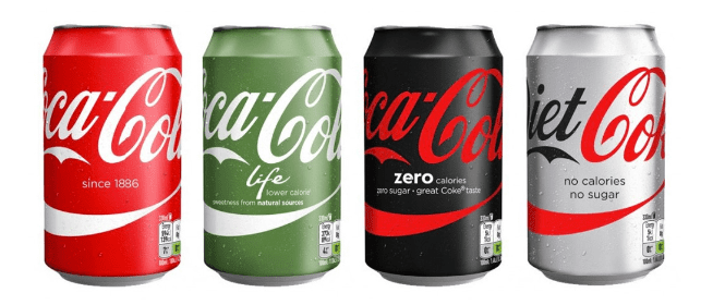
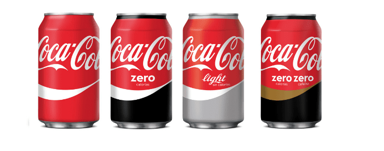
The new colour scheme in Spain saw the reversion to red as the primary colour on all of the product variations, with the secondary colours of black, silver and gold as shown in figure 3. It is interesting to speculate that this is part of a colour psychology experiment by Coca Cola marketers to look at the effect on sales of this new colour scheme and leaning on cultural differences in the reaction to colour as well as brand recognition and recall.
Figure 3. Coca Colour Products Available in Spain
Walkers, the UK’s largest crisp producer, also has an interesting variation in the colour of it’s packaging in different countries. Walkers salt and vinegar variety in the UK has green packaging, while the international brand Lays has the exact same product in blue packaging as shown in figure 4 (ABA Design, 2016).
Figure 4. Walkers International and UK Salt & Vinegar Product
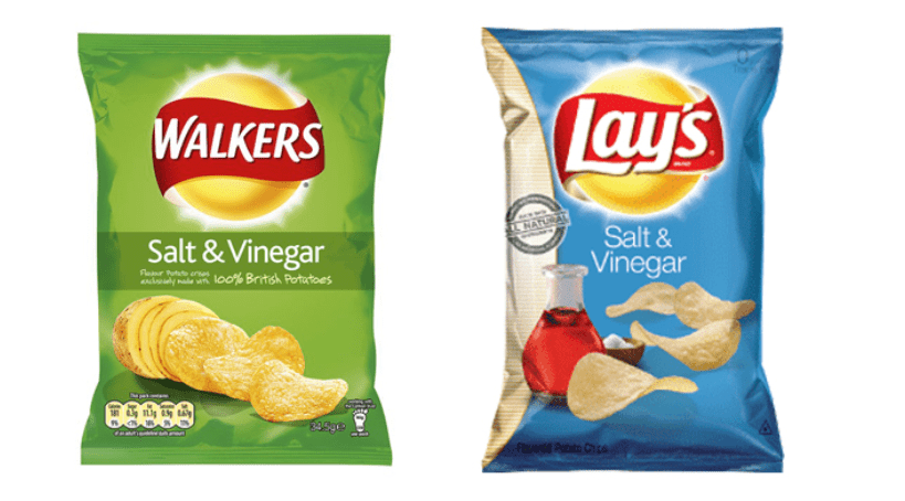
Again, there is no logical reason for such a variation in terms of the colour of the packaging apart from cultural preferences to colour and brand recognition based on experimental data.
Another major example of the use of colour in contemporary marketing practice is to influence consumer to take specific actions in the online environment. Many examples can be found online of what is termed A/B testing, where marketers split test different elements on a page to see which performs best in terms of conversions / sales. Figure 5 shows an example of an A/B based on the colour of the call-to-action (CTA) button.
Figure 5. A/B Testing with CTA Colour

In the above example, the authors reported a 21% increase in the click rate on the red version of the CTA button (Ciotti, 2016). Not only can colour increase attention due to high contrast, it can also elicit an emotional response with respect to that colour. In the above example, it is more that likely the case that ‘excitement’ is the emotional response the marketer is trying to elicit.
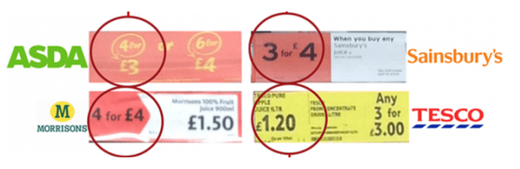
In retail, colour is also used very effectively to influence consumer’s purchase decisions. The big four supermarkets in the UK all use colour in their promotional offers – (a) to condition users to see offers and (b) to use colour to influence the purchase decision (Shopping Behaviour Xplained, 2015). In figure 6 we see how each of the supermarkets do this – primarily using the colours red and yellow (which are associated with excitement, happiness etc.)
Figure 6. Colour Psychology and Retail Promotional Offers
In conclusion, it is evident from the widespread use and application of colour psychology in marketing and the scarcity of research on the area that future research is warranted. It will be important to further the body of research on cross-cultural variations in responses and attitudes to colour as brand become more globalised with the enabler of the internet and e-commerce. Furthermore, as brands become more and more competitive and try to achieve distinctiveness and to connect with their consumer, it will be important to understand the role that colour has in this interplay.
Labrecque, L.I. and Milne, G.R., 2012. Exciting red and competent blue: the importance of color in marketing. Journal of the Academy of Marketing Science, 40(5), pp.711-727.
Romaniuk, J. and Nenycz-Thiel, M., 2014. Measuring the Strength Of Color Brand-Name Links. Journal of Advertising Research, 54(3), pp.313-319.
Madden, T.J., Hewett, K. and Roth, M.S., 2000. Managing images in different cultures: A cross-national study of color meanings and preferences. Journal of international marketing, 8(4), pp.90-107.
Cyr, D., Head, M. and Larios, H., 2010. Colour appeal in website design within and across cultures: A multi-method evaluation. International journal of human-computer studies, 68(1), pp.1-21.
Aslam, M.M., 2006. Are you selling the right colour? A cross‐cultural review of colour as a marketing cue. Journal of marketing communications, 12(1), pp.15-30.
Gorn, G.J., Chattopadhyay, A., Sengupta, J. and Tripathi, S., 2004. Waiting for the web: how screen color affects time perception. Journal of marketing research, 41(2), pp.215-225.
Moore, R.S., Stammerjohan, C.A. and Coulter, R.A., 2005. Banner advertiser-web site context congruity and color effects on attention and attitudes. Journal of advertising, 34(2), pp.71-84.
Miller, E.G. and Kahn, B.E., 2005. Shades of meaning: the effect of color and flavor names on consumer choice. Journal of consumer research, 32(1), pp.86-92.
Babin, B.J., Hardesty, D.M. and Suter, T.A., 2003. Color and shopping intentions: The intervening effect of price fairness and perceived affect. Journal of Business Research, 56(7), pp.541-551.
Cheng, F.F., Wu, C.S. and Yen, D.C., 2009. The effect of online store atmosphere on consumer’s emotional responses–an experimental study of music and colour. Behaviour & Information Technology, 28(4), pp.323-334.
UnderConsideration (2015) Brand new: New packaging for coca-cola in Spain. Available at: http://www.underconsideration.com/brandnew/archives/new_packaging_for_coca-cola_in_spain.php (Accessed: 1 December 2016).
ABA Design (2016) Colour branding and why salt & vinegar crisp packaging is blue? Available at: http://www.aba-design.co.uk/colour-branding-why-are-salt-vinegar-crisps-blue/ (Accessed: 4 December 2016).
Ciotti, G. (2016) The psychology of color in marketing and Branding. Available at: https://www.entrepreneur.com/article/233843 (Accessed: 2 December 2016).
Shopping Behaviour Xplained (2015) In-store promotions: Ask the psychologists, not the accountants. Available at: http://blog.sbxl.com/2015/10/13/in-store-promotions-ask-the-psychologists-not-the-accountants/ (Accessed: 8 December 2016).
Get in touch with a brief summary of your requirement and we’ll be happy to discuss your project in an open and transparent manner.
Request a Consultation
As the European Accessibility Act (EAA) 2025 approaches, organisations must proactively enhance their digital accessibility. This guide outlines criti..
Read More
This article delves into the rapidly evolving world of voice search technology and its potential impact on the advertising industry. It highlights the..
Read More
Explore the pivotal role of SEO audits in digital marketing. Our article delves into how advanced audit elements provide insights for competitive stra..
Read More
To get customers, it’s imperative to be seen by the mass. Every successful company is unique and needs contrasting digital marketing strategies. Book a meeting with us and we will help you find the correct strategy for your company.
Our Approach
